LeadTrack: Top Leadership Competition
Scale & Impact
- Over 1,000,000 registrations — the largest leadership competition in Russia
- Participants from 180+ countries — an international community of professionals
- 250,000+ participants — a multi-stage selection: tests, case studies, interviews
- Mentors — top leaders: ministers, governors, and executives of major corporations
My role
- Set up cross-team processes and a product-oriented workflow
- Designed the site map and user flows
- Created and developed interface layouts
- Developed and implemented a unified design system
- Oversaw UX quality and managed design handoff to developers
- Prepared project documentation and specifications for development
Site Map & Key User Flows
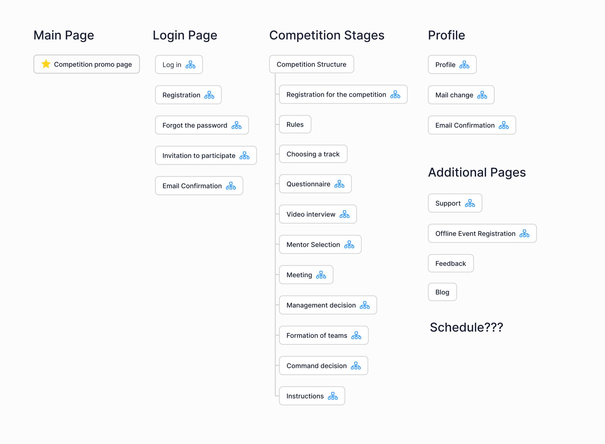
When I joined, the platform lacked structure, documentation was minimal, and user flows were unclear, making it hard to plan our work.
I requested the service architecture from developers and used it to create a site map. I identified key user flows and pages, then aligned priorities with the product owner, lead developer, QA.
Result
We gained a clear vision of the product’s structure and scope. The site map became the basis for user flows and interface design, making the process systematic and transparent.
Processes & Problem-Solving
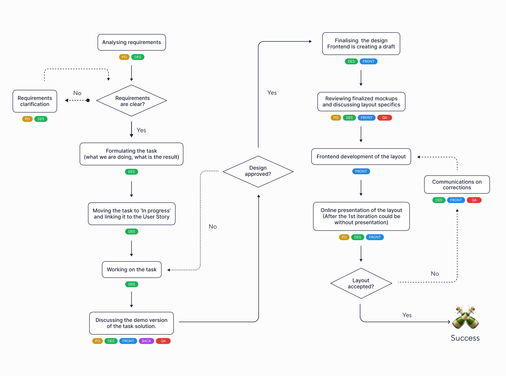
Initially, UX/UI tasks were handled manually and without a clear system—there were no defined stages, handoffs, reviews, or synchronization.
I introduced and visualized a new workflow:
- Outlined key steps from task creation to final review
- Presented and aligned the process with the team
- Implemented a system that made our work structured and manageable for everyone
Result
The team began working within a unified, predictable process, leading to higher quality and consistency. The workflow diagram became the foundation for the team's future work.
User flows
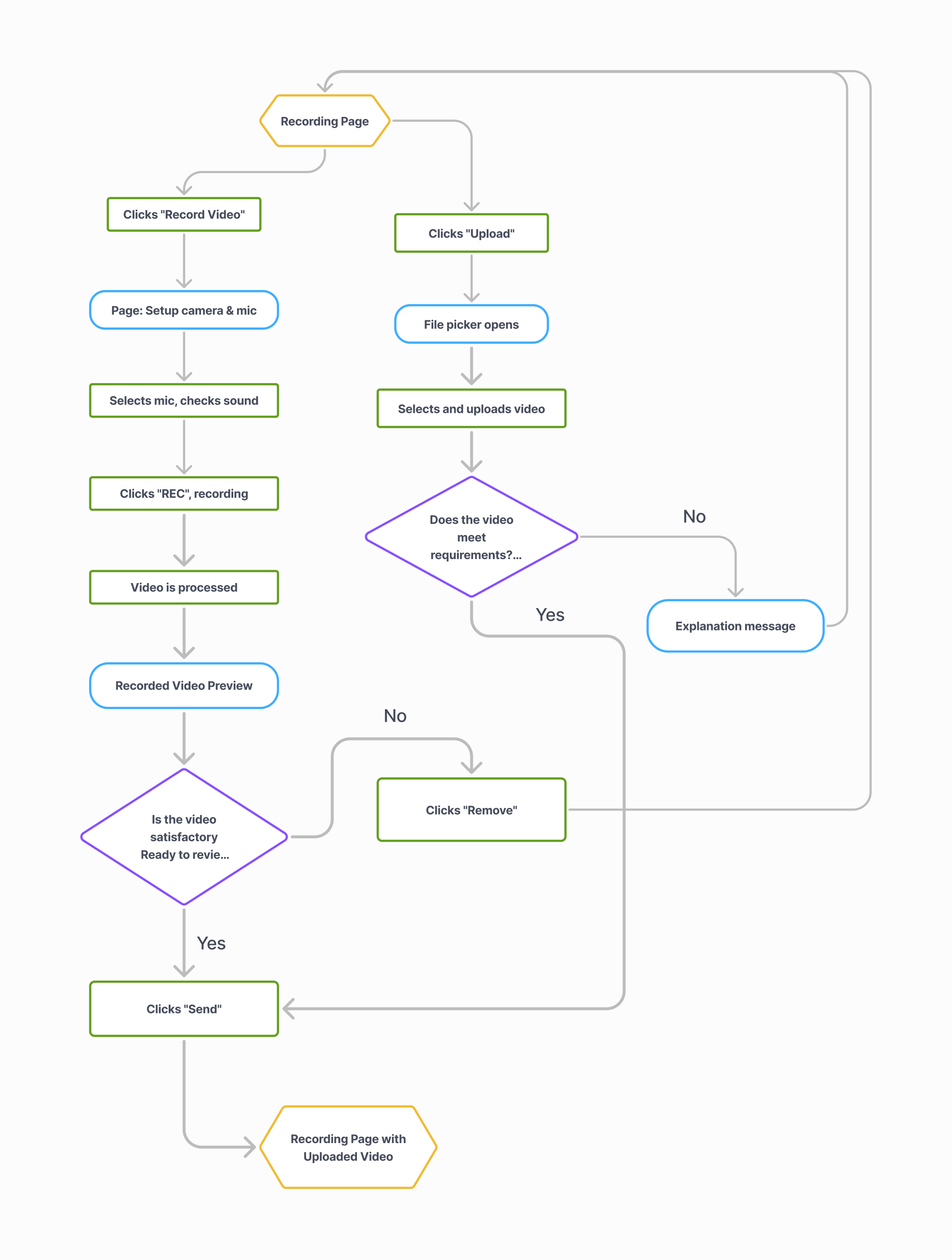
When designing user flows, I frequently used flowcharts. This helped me dive deeper into the logic behind each scenario and communicate with the product owner and developers on a structural.
It allowed us to focus on user logic, clarify key paths, and ensure everyone was aligned on how the product should work.
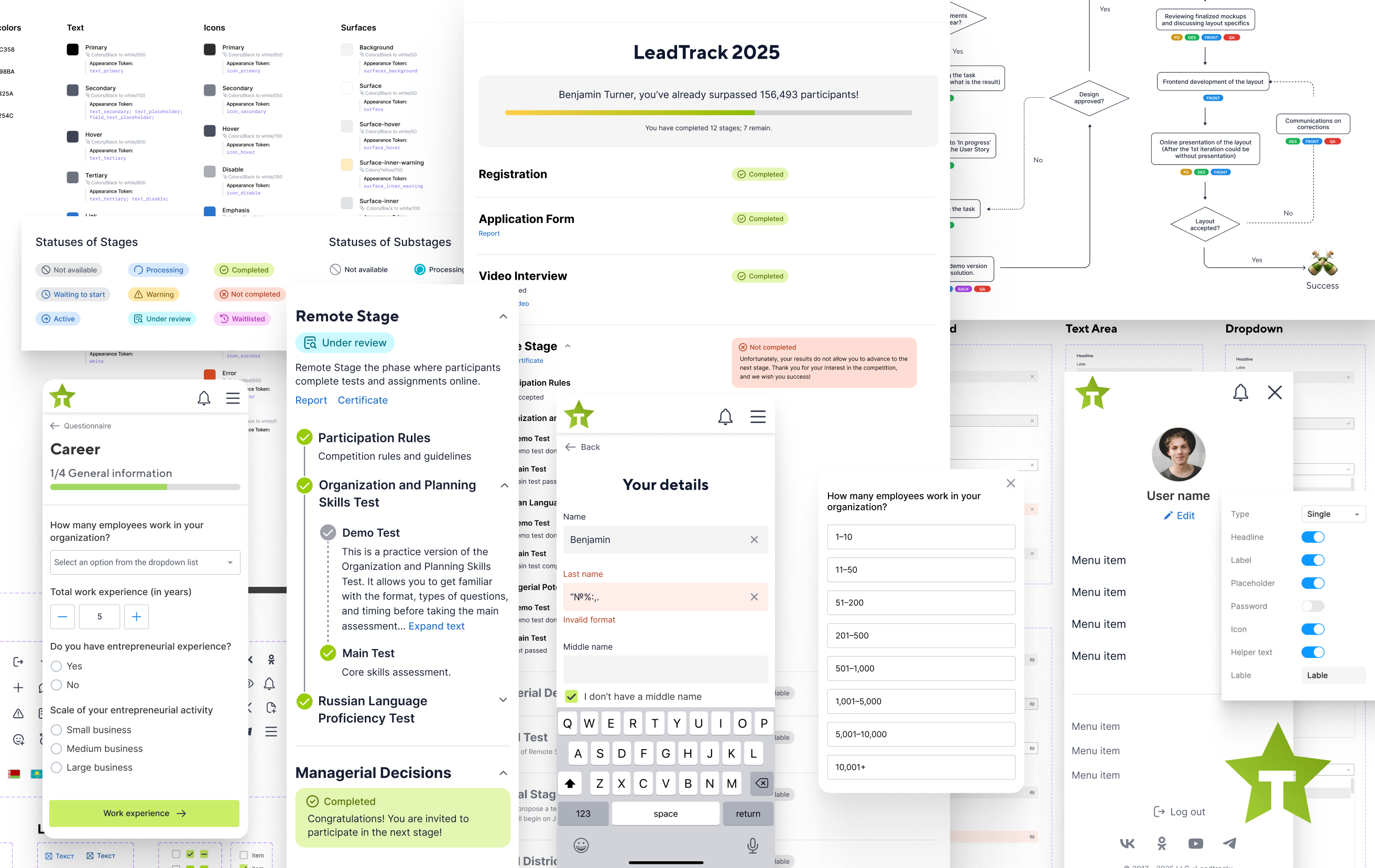
Competition Roadmap — Stage Navigation Redesign
This is the central hub of the platform and its most frequently used page. Here, participants spend the majority of their time: tracking statuses, collecting feedback, and navigating every stage of the competition.
Before the redesign
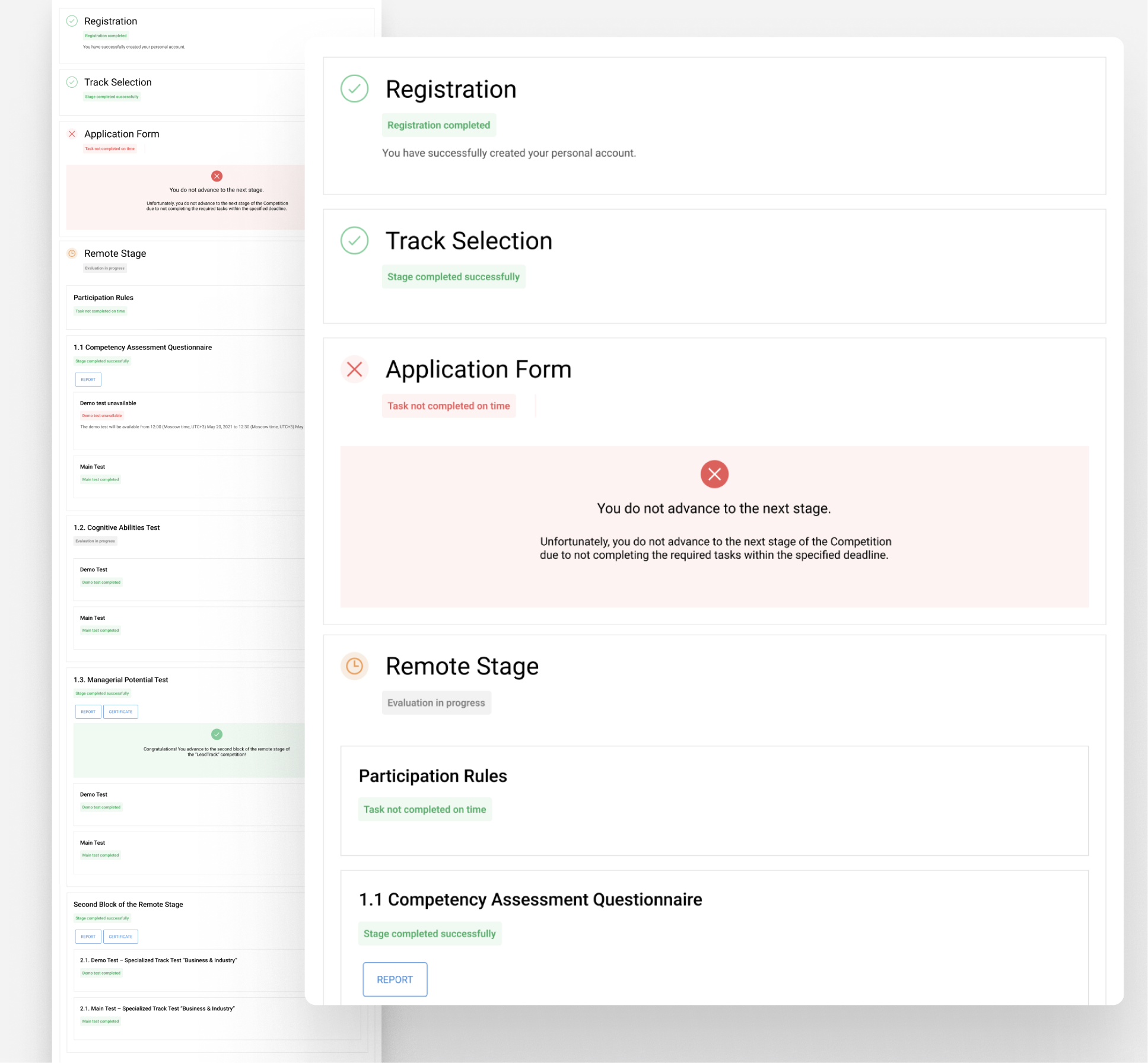
- The page was cluttered, with no clear hierarchy between stages and sub-stages.
- Statuses were ambiguous, making it hard to tell where the user was and what to do next.
- Visual grouping was weak — all blocks looked similar, reducing the sense of structure and progress.
- Inconsistent styles for buttons, badges, and labels created visual noise.
Process
The initial task sounded simple: “just redesign it to look nice.” But once I started, it became clear that the documentation was incomplete and, in places, unclear.
The biggest challenge was figuring out the statuses — not just redesigning them, but structuring them and making them truly understandable for participants.
The documentation didn’t provide direct answers, so I gathered information from: existing materials and guidelines, the working test version of the website;, conversations with colleagues.
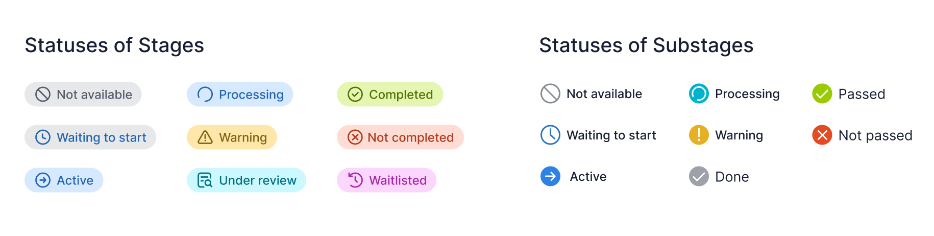
It took several iterations, as even team members were sometimes confused and gave contradictory answers. Eventually, I compiled a complete list of existing statuses, removed duplicates and unnecessary ones. Then I presented the structured version to the team, explained the logic, and got final approval.
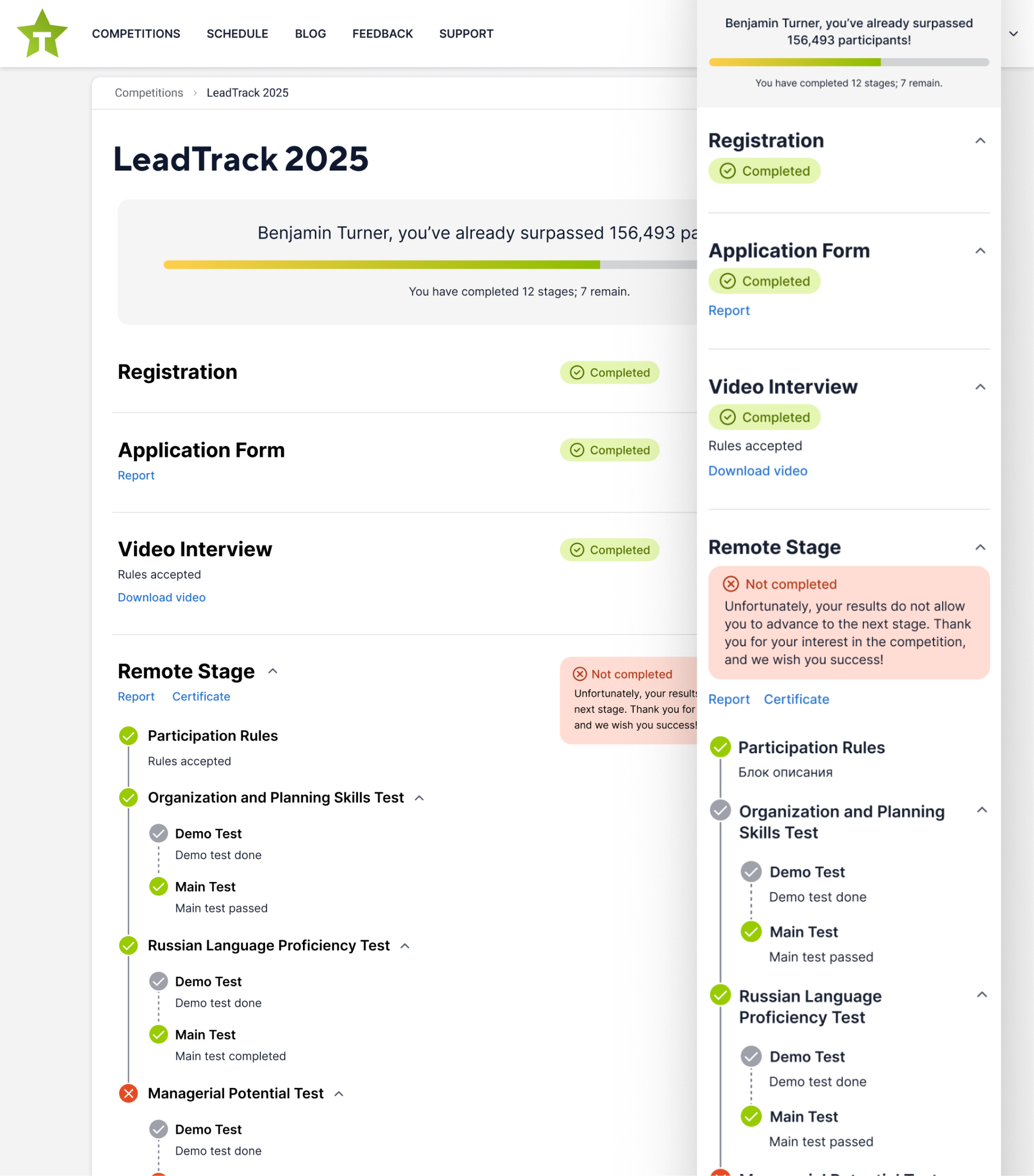
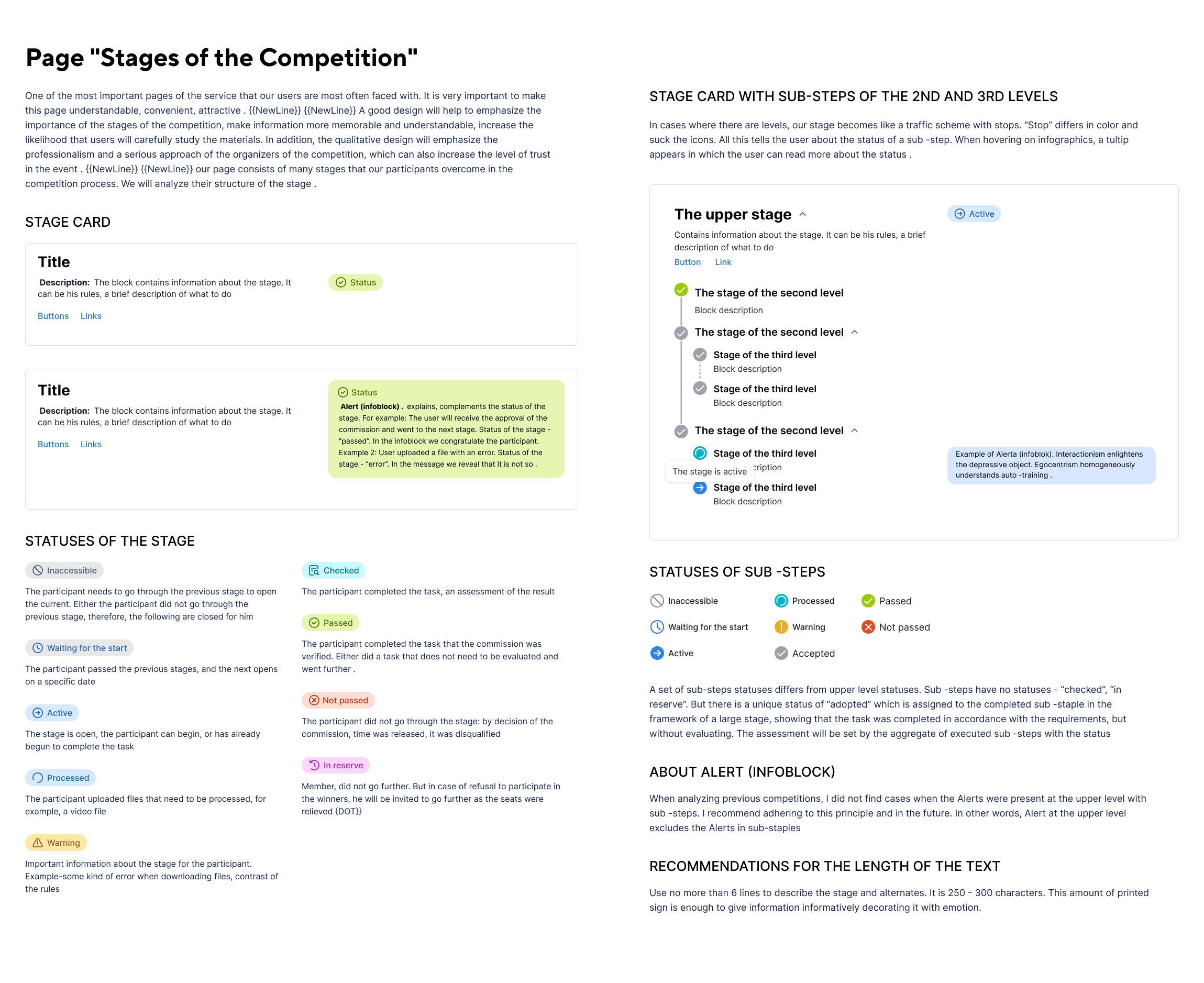
The stage card
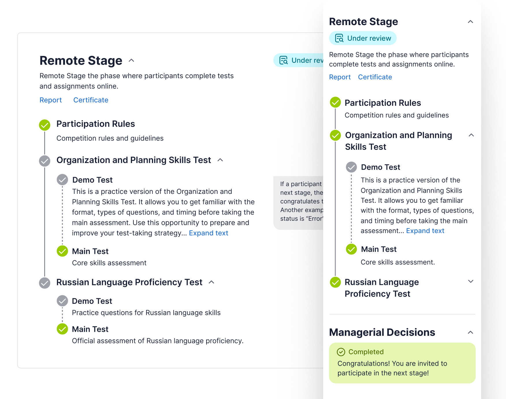
The stage card replaces the old table layout with a clear “journey” format, inspired by transit route maps. It presents each stage and substage in a structured hierarchy with clear statuses and concise descriptions, making navigation easier while instantly showing progress, context, and next steps.
Final Competition Stages Design
Key Improvements and Design Decisions
- Created custom icons for each status and introduced a color-coding system for better recognition
- Moved from a “table” format to a “journey map” format, inspired by public transport route diagrams
- Established a clear hierarchy between stages and sub-stages; simplified and standardized statuses
- Added a motivational block (“You’ve already surpassed 156,493 participants — that’s 80%!”)
- Ensured participants always know where they are, what they’ve completed, and what’s next
Finally, I documented the entire page — describing the logic, structure, statuses, and visual rules — so that it could be easily maintained and scaled in the future.
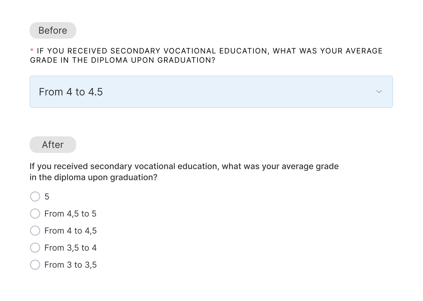
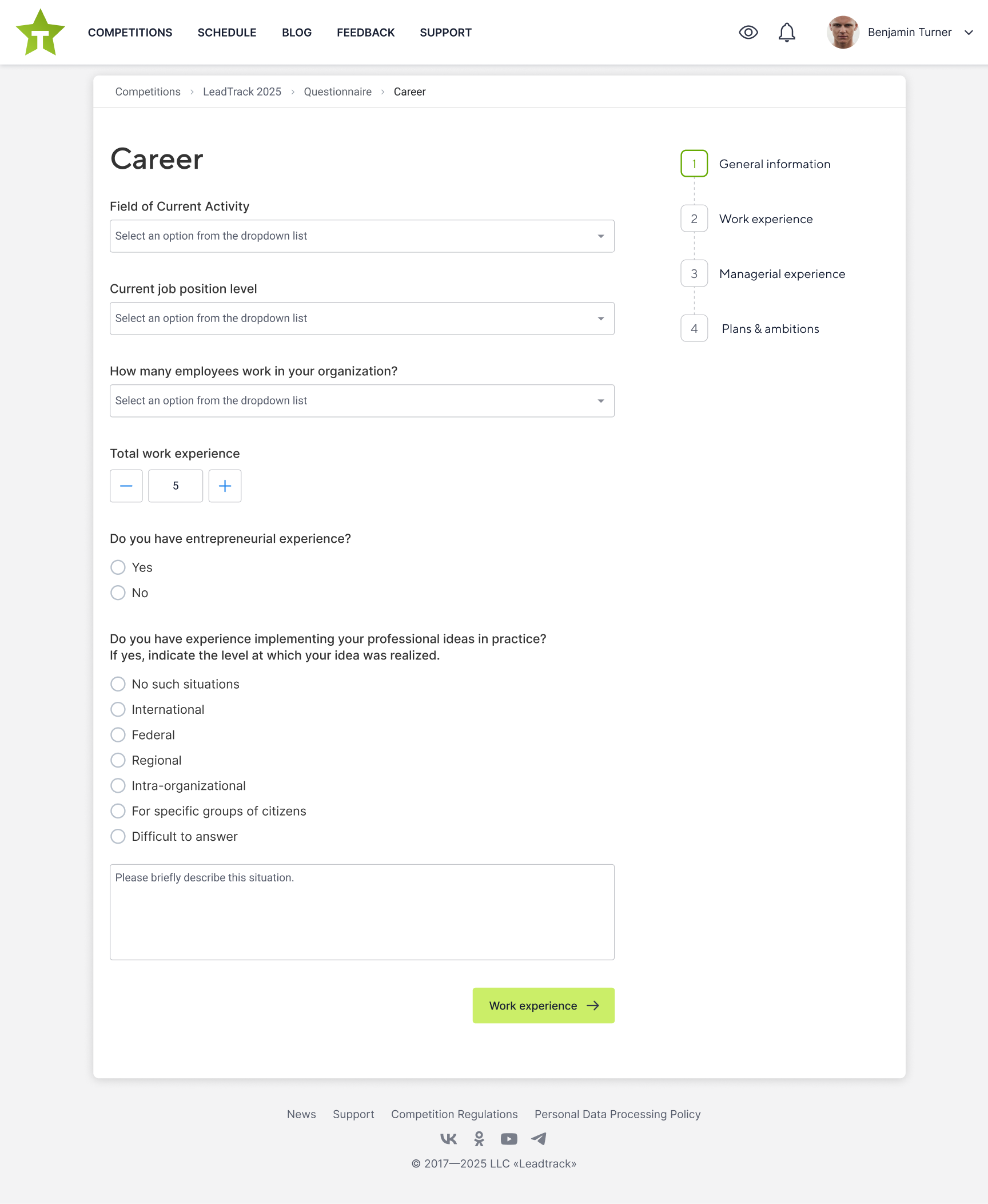
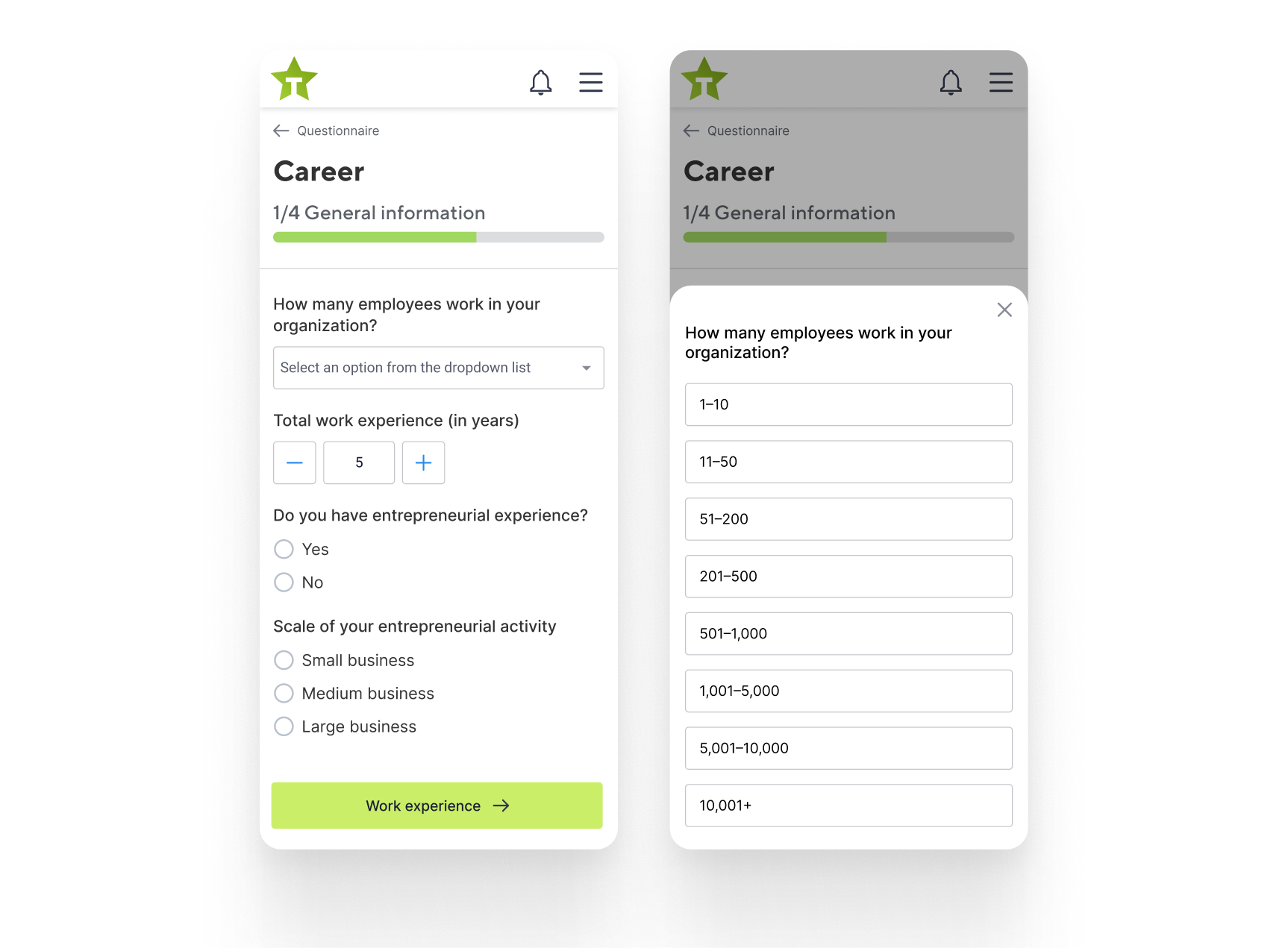
Questionnaire
One of the first competition stages — and the one where most participants drop out.
Before
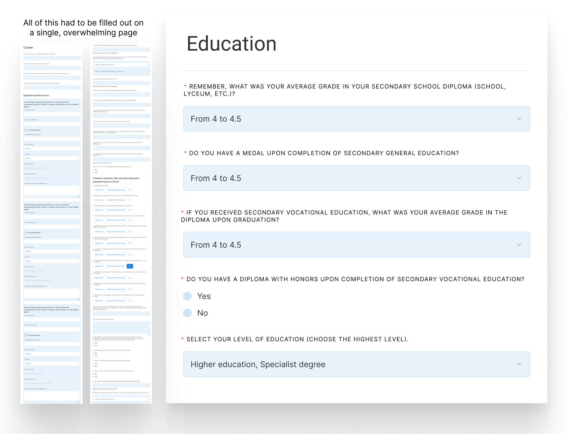
Initially, the task was simply to “make it look better with a new UI.” But once I saw this wall of text, I was genuinely shocked. I actually felt sorry for our users. Some sections — for example, Career — were incredibly long, containing hundreds of questions. Filling this out on mobile was almost impossible.
Process
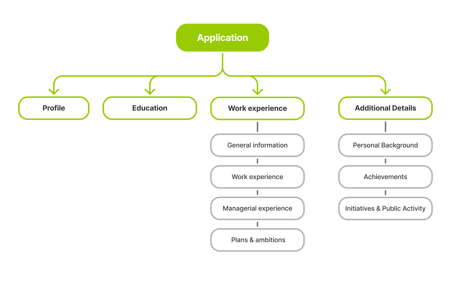
I decided to postpone UI work and focus on UX first. After studying the questionnaire in detail before a team meeting, I proposed:
- Split into 4 logical sub-stages: General Info → Work Experience → Managerial Experience → Plans & Ambitions.
- Broke complex sections into manageable steps.
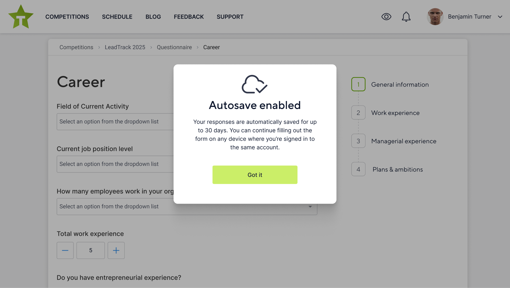
- Introduced autosave, ensuring answers persist even when users switch devices.
- Validated changes via quick user testing + team review.
- Cleaned up UX errors: removed ALL CAPS, improved readability, swapped inappropriate inputs, added tooltips..
Result
- +30% increase in completion rate.
- Mobile submissions tripled post-redesign.
- User testing showed reduced frustration and higher satisfaction scores.
- The new interface became concise, intuitive, and visually inviting.
- Autosave eliminated most "lost progress" support tickets.
Other Key Contributions
Beyond the Questionnaire and Competition Roadmap, I redesigned key participant and admin flows — registration, login, password recovery, email/phone verification, profile, video interview, moderation, and support — applying one principle: clarity first, friction last.
Design System
One of my proudest achievements on the project was creating a design system from scratch — a unified framework that kept the platform visually coherent and technically scalable.Before starting, I collaborated closely with the brand team to ensure the system fully reflected the visual identity and spirit of the competition.
Color variables
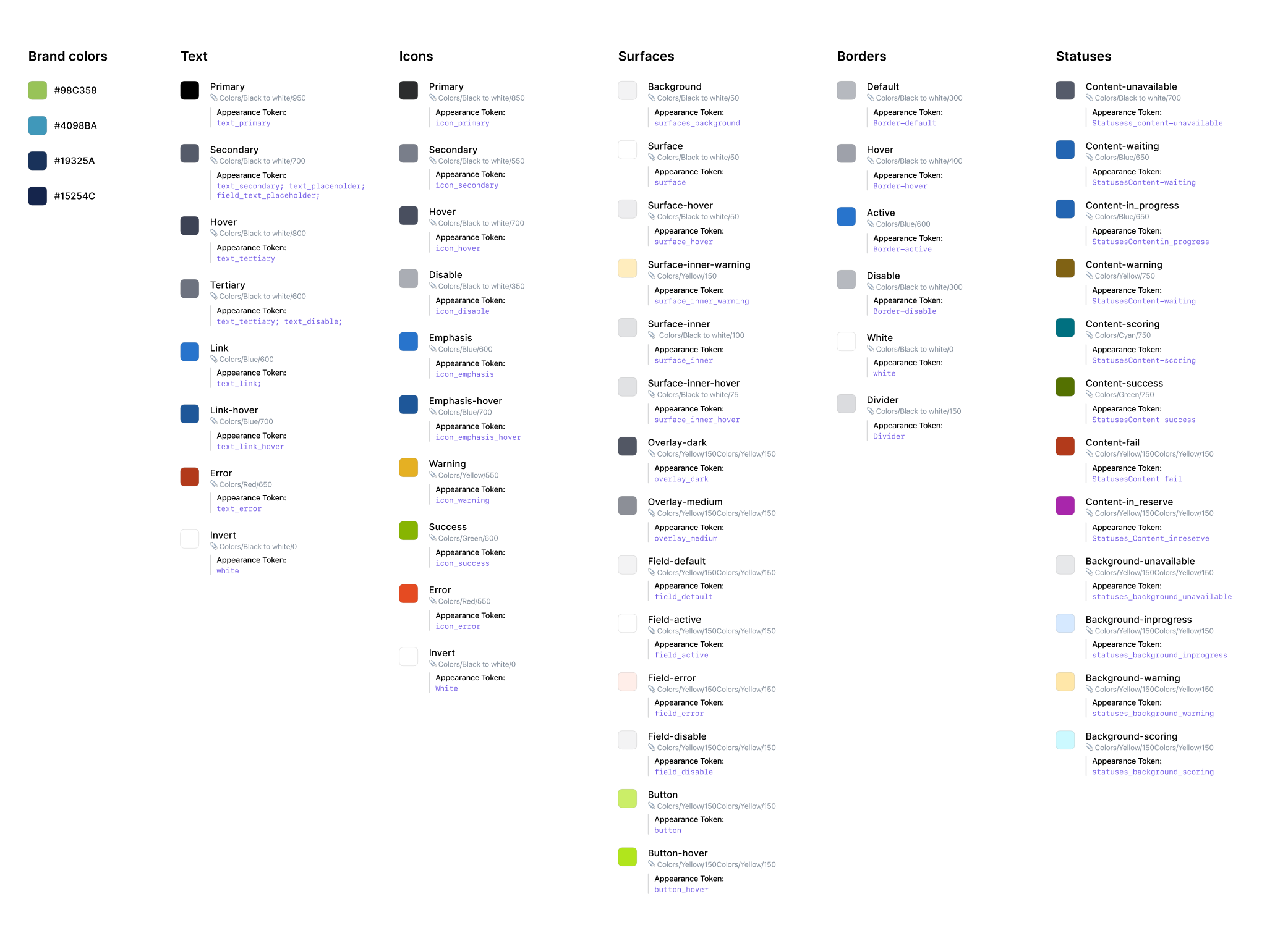
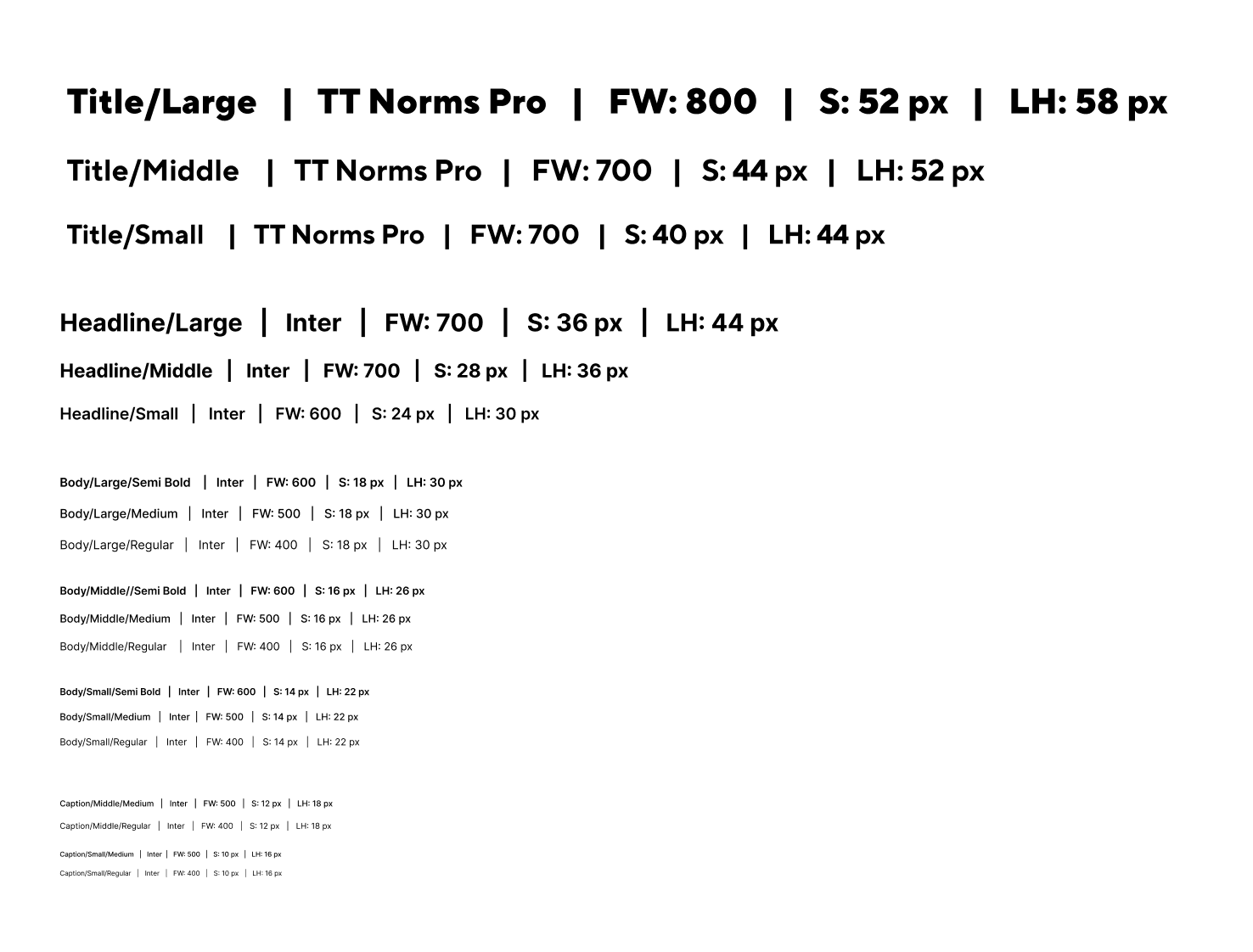
Typography
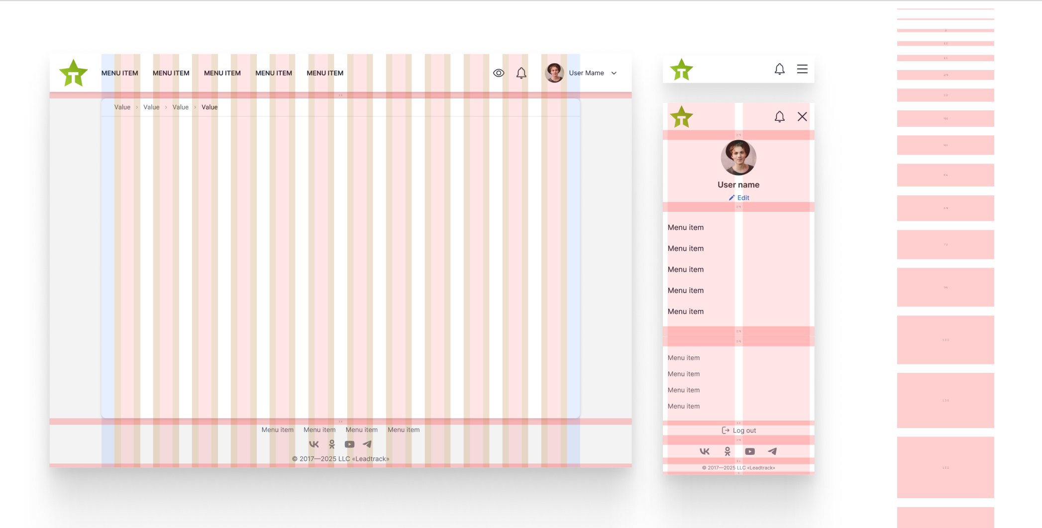
Grid & Navigations
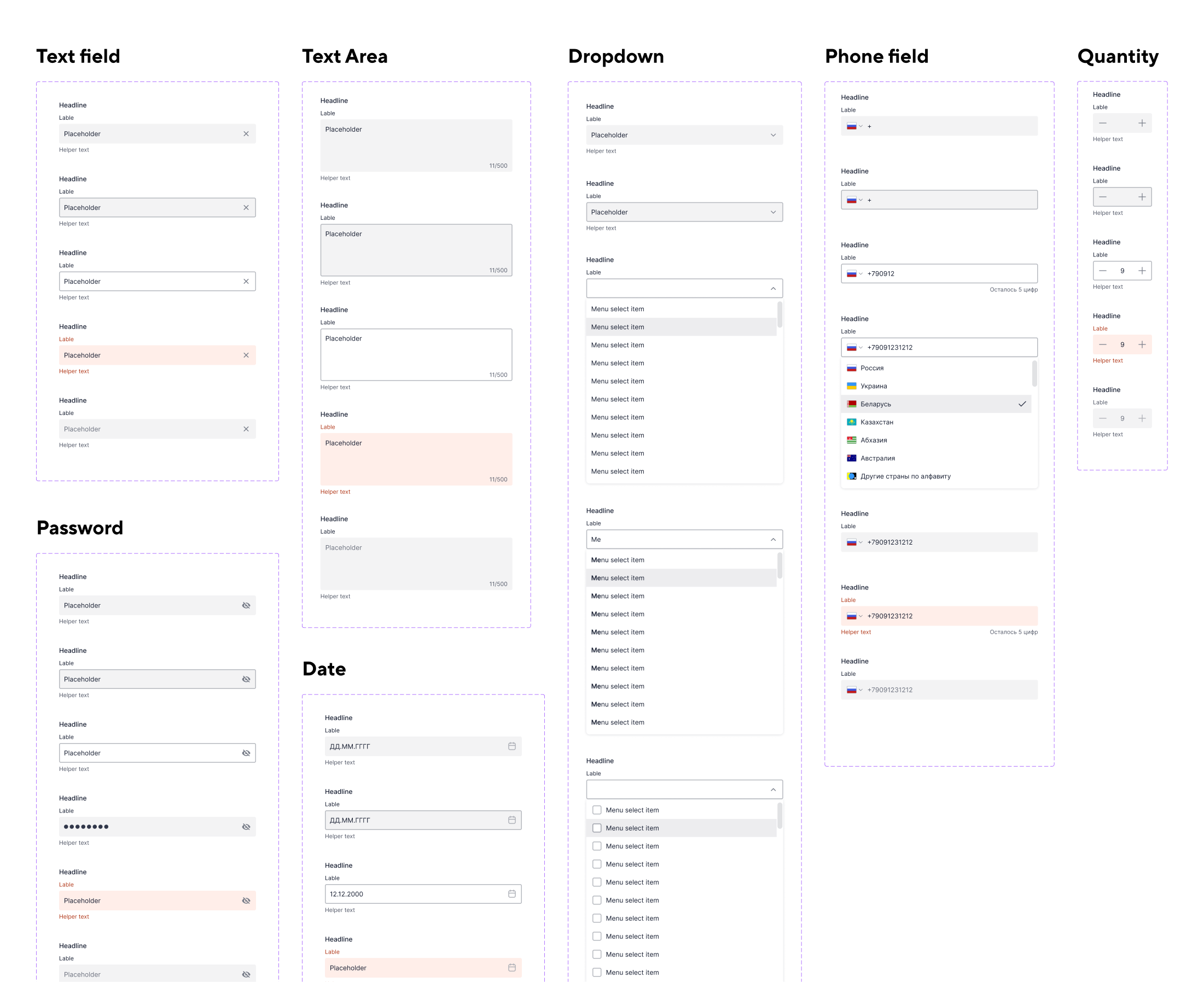
Inputs
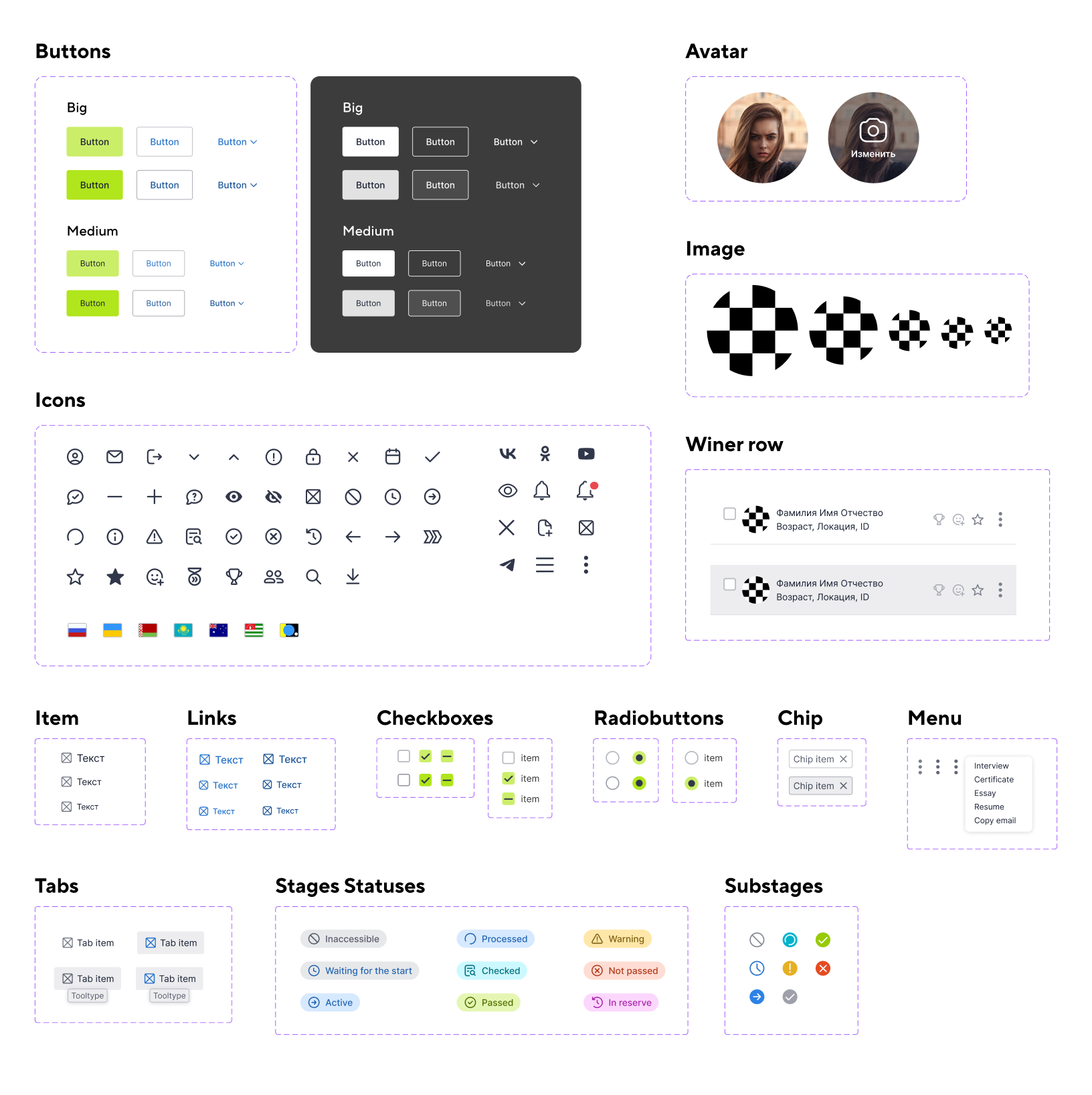
Other components
Impact:
- Consistent visual language across all products
- Faster development via reusable components and templates
- Higher implementation accuracy with documentation
- Better cross-team collaboration and decision-making
- Components adapted for perfect display on any platform
The system became the single source of truth, cutting inconsistencies and speeding up delivery.
Conclusion
LeadTrack was a project where I not only delivered design solutions but also restructured the entire product experience under tight deadlines and incomplete documentation.
I combined user empathy, systematic thinking, and cross-team collaboration. When faced with unclear requirements — like the Competition Stages statuses — I gathered input from stakeholders, structured it, and proposed a clear model that was approved.
Despite strict timelines, I balanced UX quality with technical feasibility, iterating quickly and aligning closely with development.
Key contributions:
- Transformed complex, unclear flows (Questionnaire, Competition Stages) into intuitive, motivating experiences
- Structured incomplete documentation, resolved contradictions, and built a clear status model approved by the team
- Delivered prototypes that became the direct basis for development, speeding up implementation
- Built a brand-aligned design system, improving consistency and reducing ambiguity
- Balanced UX quality with technical feasibility under tight deadlines
- Reduced support requests by making participants more self-sufficient
- Increased questionnaire completion rates through better structure, navigation, and mobile usability
While some ideas remain for future iterations, the project showed how communication, empathy, and structured design thinking can directly improve both user satisfaction and business results.
